All components in edoc automate are independent plug-ins. You can add your own new actions at any time.
Two types of components are defined in edoc automate:
-
Components that are supplied by default in edoc automate.
-
Components that you define as an app developer. You can only use your own components in edoc automate.
Both component types are equivalent, but they differ in the namespace used and the storage location in the app.
Class diagram for components
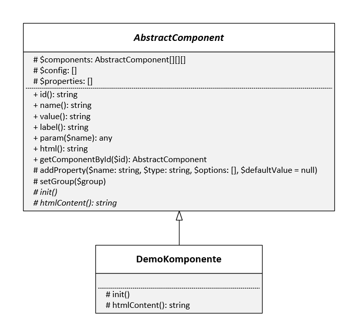
You can also use components as superordinate and subordinate components.
Standard for namespaces
You can find the default actions under:
<?php
// Namespace for system components
namespace edoc\appserver\app\components;
You can save your own plug-ins under:
<?php
// Namespace for app components
namespace edoc\appserver\app\components\plugins;
Add your own app components
If you want to develop your own components in your app, you must create a new plug-in in the app folder /<app>/plugins/components via WebDAV, for example.
Here's how
-
Create a new folder with the name of the component in the /<app>/plugins/components folder. The name of the folder, the file, and the class must match.
-
Create a new file in the folder with the same name and the extension .php (e.g. Number.php).
-
Open the file with any text editor.
-
Add the following content to the file:
PHP<?php namespace edoc\appserver\app\components\plugins; use edoc\appserver\app\AbstractComponent; class Number extends AbstractComponent { public function init() { // Set name, description and icon $this->setMetadata('Number', 'Component for numbers', 'component-input'); // Set component group $this->setGroup('text'); // Add properties $this->addProperty('Min', 'number' ['min' => 0, 'value' => '0']); // since 22.3.x you can use self::PROP_TYPE_NUMBER $this->addProperty('Max', 'number'); // Add system-events. $this->registerEvent('input', new UpdateValue($this)); } public function htmlContent() { $html = '...'; return $html; } } -
Save the file with the correct encoding: UTF-8 without BOM.
You can use the new component in the edoc automate editor.
You may need to reload edoc automate to use the action.
You can find a list of possible property types under: Overview of the property types for components in edoc automate
Traits: The PHP method for reusing code
edoc automate uses traits to add various properties to the component, which are then the same in all components.
You can use the following traits:
-
\edoc\appserver\app\component\Editable: Activates the property that allows you to change the editability of a component with actions. -
\edoc\appserver\app\component\Visibility: Activates the property with which you can also change the visibility of a component with actions. -
\edoc\appserver\app\component\Disable: Activates the property with which you can activate and deactivate the component. -
\edoc\appserver\app\component\PropertyClass: Adds the Class property to a component to define CSS classes. -
\edoc\appserver\app\component\PropertyMaxLength: Adds the Max Length property to a component to define the maximum length for entered texts.
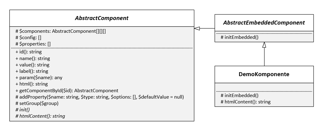
Components with subcomponents
You can define new components that also contain components in certain places, e.g. Table, Columns, or Container.
For these components, you must use the parent class edoc\appserver\app\AbstractEmbeddedComponent; instead of edoc\appserver\app\AbstractComponent;.
You must save all instances for the subordinate (child) classes in the components class property in a multidimensional array with rows and columns.
Example of subordinate and superordinate components
<?php

namespace edoc\appserver\app\components\plugins;

use edoc\appserver\app\AbstractEmbeddedComponent;

class ComponentWithChildren extends AbstractEmbeddedComponent
{
    protected function initEmbedded()
    {
    }

    public function htmlContent()
    {
      $html = '...';

      return $html;
    }

    public function getComponentByName($name)
    {
      // search in $this->components
      return false;
    }

    public function getComponentById($id)
    {
      // search in $this->components
      return false;
    }
}
Display documentation for your own components
You can display the documentation for your own components by defining a comment in DocBlock format above the class. A slightly adapted DocBlock format is used in edoc automate, which may not be interpreted correctly by all standard DocBlock parsers.
Things to know
You can format the texts in the documentation using Markdown commands:
-
Only Bold and Italic formatting is supported.
-
Insert line breaks with \n.
Example of documentation
<?php

namespace edoc\appserver\app\components\plugins;

use edoc\appserver\app\AbstractComponent;

/**
 * Number Component
 *
 * Component to enter numbers.
 *
 * @param NUMBER $Min Min Number
 * @param NUMBER $Max Max Number
 *
 */
class Number extends AbstractComponent
{
  // ...
}
Use Bootstrap for your own components
If you want to use the Bootstrap framework to create your own components, you must consider the following aspects:
-
Version: The version used must be compatible with the Bootstrap version used by edoc automate.
-
Assets: Additionally required JavaScript libraries (Bootstrap, Popper.js etc.); and CSS styles must be integrated into your app yourself or via the component.
-
Modal: If your own component is to be displayed in a modal and requires JavaScript functions from Bootstrap, you must set the attribute
data-eas-modal-propagate-click="true"in the component. Only with this attribute are click events of the component forwarded to higher-level elements of the modal.